

 The Environmental and Conservation Issues Room


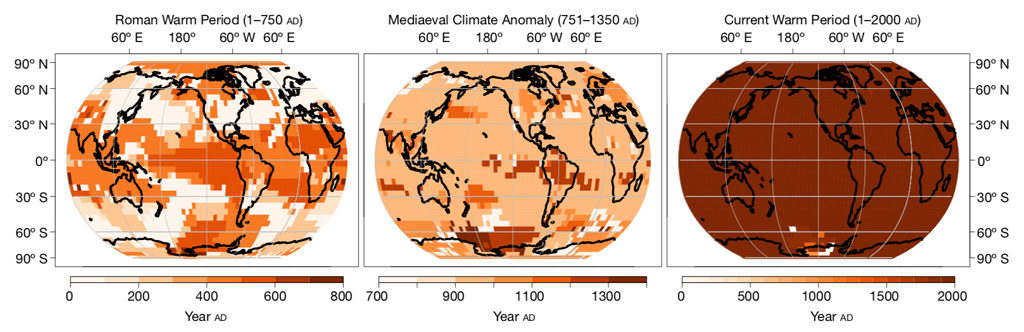
The 3 graphs below are from an article at the website, carbonbrief.org, titled "The globally coherent rise in temperatures seen since the start of the industrial revolution is unparalleled in at
least the past 2000 years." This article is a summary from a July 2019 article in the journal, Nature. The graph on the right represents the warmest 51 year periods during the past 2000 years.
The tiny squares near the bottom represent areas where the earth (2% of it) was warmer in the past than than during the late 20th century. The middle graph represents the Medieval Warming
Anomaly (MWA) with 40% of the globe experiencing warming at the same time. The Roman Warm Period, the MWA, and the "Little Ice Age" were all primarily regional events with warming or
cooling not occurring simultaneously over most of the earth's surface.
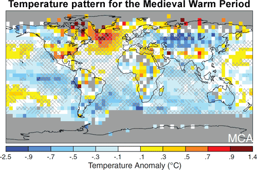
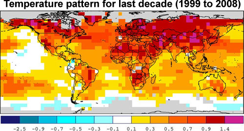
The bottom 2 graphs illustrate that the Medieval Warm Anomaly was not so warm compared to the 1999-2008 time frame; most regions were much cooler than the 1961 to 1990
period.
This science is consistent with previous studies and indicates that the present warming is not the result of natural (non-human) causes. Natural cycles tend to shift heat from
one region of the globe to another without greatly affecting the global mean temperature.
Reconstructed temperature anomaly from 950 AD to 1250 AD, temperature anomaly is relative to the 1961-1990 reference period (From Skepticalscience.com)
Gray areas indicate no adequate temperature data
Surface temperature anomaly for the period 1999 to 2008 relative to the 1961 to 1990 reference period (from skepticalscience.com)
 Reply With Quote


